Creating a new Flet app
A Flet app's UI is made up of controls, arranged on the page. Controls can be styled, nested inside each other to build layouts, and respond to events like clicks and taps.
This page walks through creating your first app, then the controls and events you'll use to build almost any UI, tying them together into a small example app.
Your first app
Create a new directory (or directory with pyproject.toml already exists if initialized with a project manager) and switch into it.
To create a new "minimal" Flet app run the following command:
- uv
- pip
uv run flet create
flet create
Any existing README.md or pyproject.toml (for example, created by uv init)
will be replaced by the one created by flet create command.
The command will create the following directory structure:
README.md
pyproject.toml
src
    assets
        icon.png
        splash_android.png
    main.py
tests
    test_main.py
You can find more information about flet create command here.
src/main.py already contains a small working counter app with a button that increments it:
import flet as ft


def main(page: ft.Page):
    counter = ft.Text("0", size=50, data=0)

    def increment_click(e):
        counter.data += 1
        counter.value = str(counter.data)

    page.floating_action_button = ft.FloatingActionButton(
        icon=ft.Icons.ADD, on_click=increment_click
    )
    page.add(
        ft.SafeArea(
            expand=True,
            content=ft.Container(
                content=counter,
                alignment=ft.Alignment.CENTER,
            ),
        )
    )


ft.run(main)
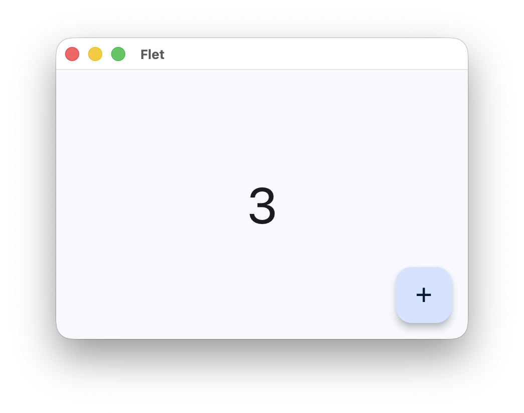
pageis the top-level container for everything in the app window (or browser tab).page.add()appends controls to the page.page.floating_action_buttonsets the round action button in the bottom-right corner.increment_clickis an event handler (see Handling events below); Flet renders the changes it makes as soon as the handler returns.
See Running a Flet app to launch it as a desktop window or in a browser.
Basic controls
You'll most likely need controls for showing text, laying out other controls, and adding a background, border, or padding.
Text
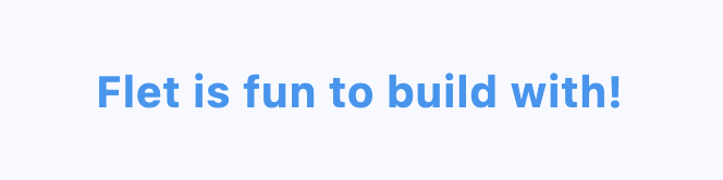
Text displays a string, with optional styling:
ft.Text("Flet is fun to build with!", size=20, weight=ft.FontWeight.BOLD, color=ft.Colors.BLUE)
Row and Column
Row and Column lay out their controls horizontally and
vertically, respectively. Both accept alignment (main axis) and vertical_alignment/horizontal_alignment
(cross axis) to control spacing and positioning:
ft.Row(
    alignment=ft.MainAxisAlignment.CENTER,
    controls=[
        ft.Icon(ft.Icons.STAR),
        ft.Text("Featured"),
    ],
)

You can nest a Column inside a Row (or vice versa) to build more complex layouts.
Stack
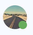
Stack overlaps its children instead of laying them out in a line. Children are
positioned with top, bottom, left, and right, which makes Stack useful for badges, overlays, and anything
else that needs to sit on top of another control:
ft.Stack(
    controls=[
        ft.CircleAvatar(foreground_image_src="https://picsum.photos/100"),
        ft.Container(
            width=14,
            height=14,
            bgcolor=ft.Colors.GREEN,
            border_radius=7,
            right=0,
            bottom=0,
        ),
    ],
)
Container
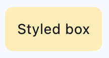
Container wraps a single control and adds visual styling around it: background color,
border, border radius, padding, margin, and fixed width/height:
ft.Container(
    content=ft.Text("Styled box"),
    bgcolor=ft.Colors.AMBER_100,
    padding=12,
    border_radius=8,
)
Container also accepts on_click, which makes it a handy way to make a control clickable when that control
doesn't have an on_click of its own: just wrap it in a Container. See Handling events
below.
Structuring the page
Beyond individual controls, page itself has properties that shape the whole app: page.title sets the window/tab
title, and page.appbar puts an AppBar (the header row with a title and actions) at
the top of the page:
def main(page: ft.Page):
    page.title = "My App"
    page.appbar = ft.AppBar(
        title=ft.Text("My App"),
        bgcolor=ft.Colors.SURFACE_TINT,
        actions=[ft.IconButton(ft.Icons.SETTINGS)],
    )
    page.add(ft.Text("Body content goes here"))

ft.run(main)
page.theme and page.theme_mode control the color scheme (light/dark and a seed color) applied across all
Material controls on the page (see Theming for more).
AppBar, Button, and most other controls follow Material Design. For an iOS-style look, Flet also ships a
parallel set of Cupertino controls (ft.Cupertino*). See Adaptive apps for
building a single app that looks native on both platforms.
Handling events
Interactive controls like Button, IconButton, and
Container accept event handlers, plain functions that run when the user interacts
with the control:
def main(page: ft.Page):
    def handle_click(e: ft.Event[ft.Button]):
        page.show_dialog(ft.SnackBar(ft.Text("Button clicked!")))

    page.add(ft.Button("Click me", on_click=handle_click))

ft.run(main)
Every event handler takes a single argument, conventionally named e, of type Event.
e.control is the control that triggered the event, so you can read its current state from there (a TextField's
on_change handler, for example, reads the new value via e.control.value). Typing the handler as
ft.Event[ft.Button], as above, tells your editor that e.control is specifically a Button.
Anything you change inside a handler (a control property, or, as above, calling a page method like
show_dialog()) is picked up automatically, so most handlers don't need to manage
updates by hand.
For lower-level pointer interactions (taps, drags, hover, scroll), wrap a control in
GestureDetector.
Example: Product catalog
Here's a small product catalog that uses everything above: an AppBar for the page header, Container and
Column/Row for layout and styling, a Stack to draw a "Sale" badge on one item, and on_click handlers to
react to taps:
import flet as ft

PRODUCTS = [
    {"name": "Desk Lamp", "price": "$24", "on_sale": False},
    {"name": "Wireless Mouse", "price": "$18", "on_sale": True},
    {"name": "Notebook", "price": "$6", "on_sale": False},
]


def main(page: ft.Page):
    page.title = "Catalog"
    page.appbar = ft.AppBar(title=ft.Text("Catalog"), center_title=True)

    def add_to_cart(product_name: str):
        def handle_click(e: ft.Event[ft.Button]):
            page.show_dialog(ft.SnackBar(ft.Text(f"Added {product_name} to cart")))

        return handle_click

    def product_card(product: dict) -> ft.Control:
        card = ft.Container(
            padding=12,
            border_radius=8,
            bgcolor=ft.Colors.SURFACE_CONTAINER_HIGHEST,
            content=ft.Row(
                alignment=ft.MainAxisAlignment.SPACE_BETWEEN,
                controls=[
                    ft.Column(
                        spacing=2,
                        controls=[
                            ft.Text(product["name"], weight=ft.FontWeight.BOLD),
                            ft.Text(product["price"], color=ft.Colors.OUTLINE),
                        ],
                    ),
                    ft.Button("Buy", on_click=add_to_cart(product["name"])),
                ],
            ),
        )
        if not product["on_sale"]:
            return card
        return ft.Stack(
            clip_behavior=ft.ClipBehavior.NONE,
            controls=[
                card,
                ft.Container(
                    content=ft.Text("SALE", size=10, color=ft.Colors.WHITE),
                    bgcolor=ft.Colors.RED,
                    padding=ft.Padding.symmetric(horizontal=6, vertical=2),
                    border_radius=4,
                    top=-6,
                    right=-6,
                ),
            ],
        )

    page.add(
        ft.Column(
            spacing=10,
            controls=[product_card(product) for product in PRODUCTS],
        ),
    )


if __name__ == "__main__":
    ft.run(main)
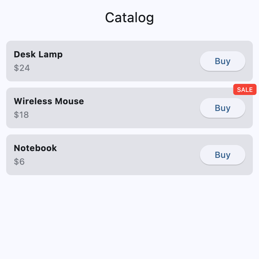
Run it with flet run and you'll get a scrollable list of product cards, each with a "Buy"
button that pops up a confirmation.
What's next
- Running a Flet app: see the apps above running as a desktop window or in a browser.
- Controls reference: the full list of controls available in Flet.
- Auto-update: how and when Flet sends control changes to the client.
- Declarative vs. imperative: once your UI needs to manage evolving state (like a shopping cart or a to-do list), this is the next thing to read.
- Theming: customize colors, fonts, and light/dark mode across the app.